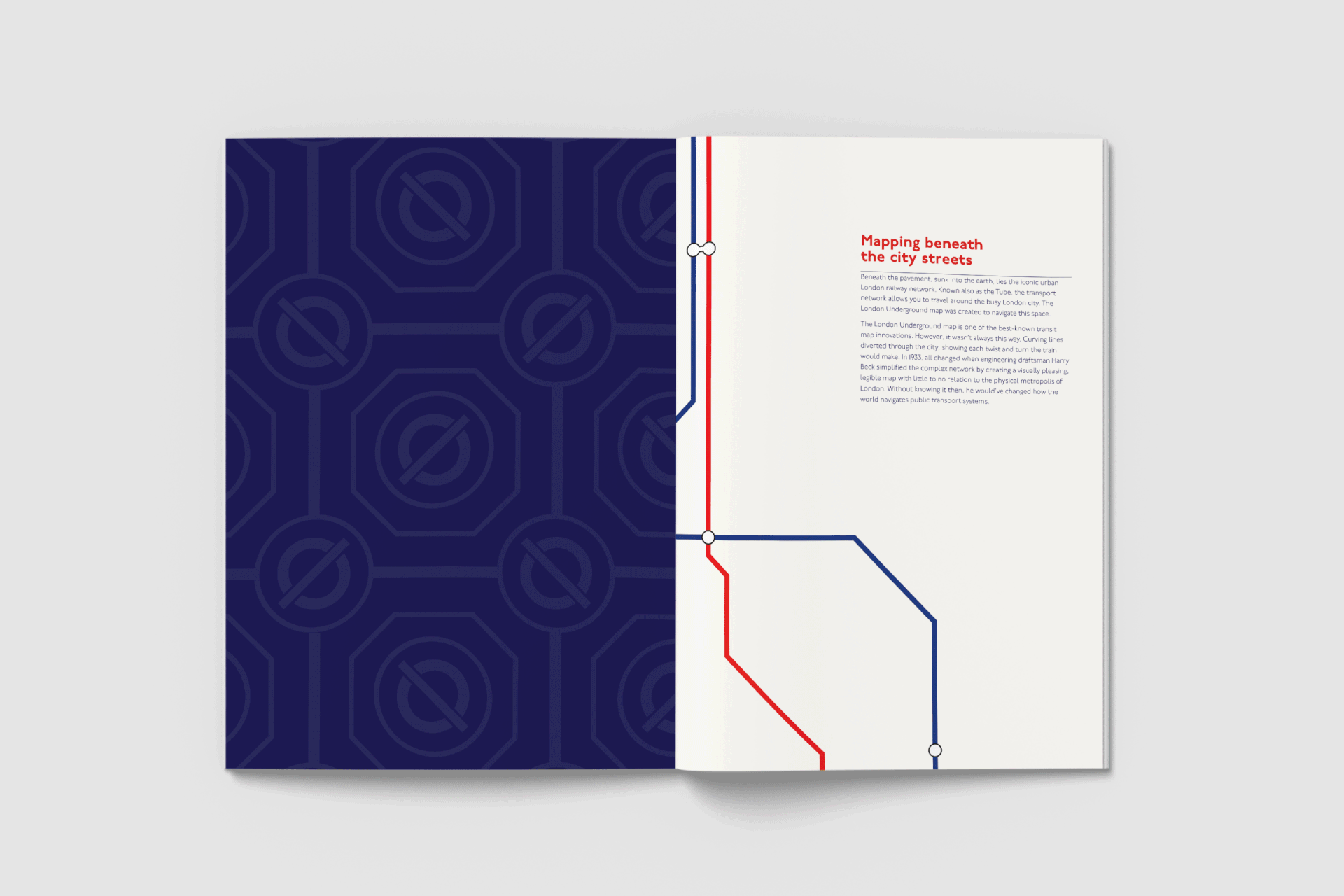
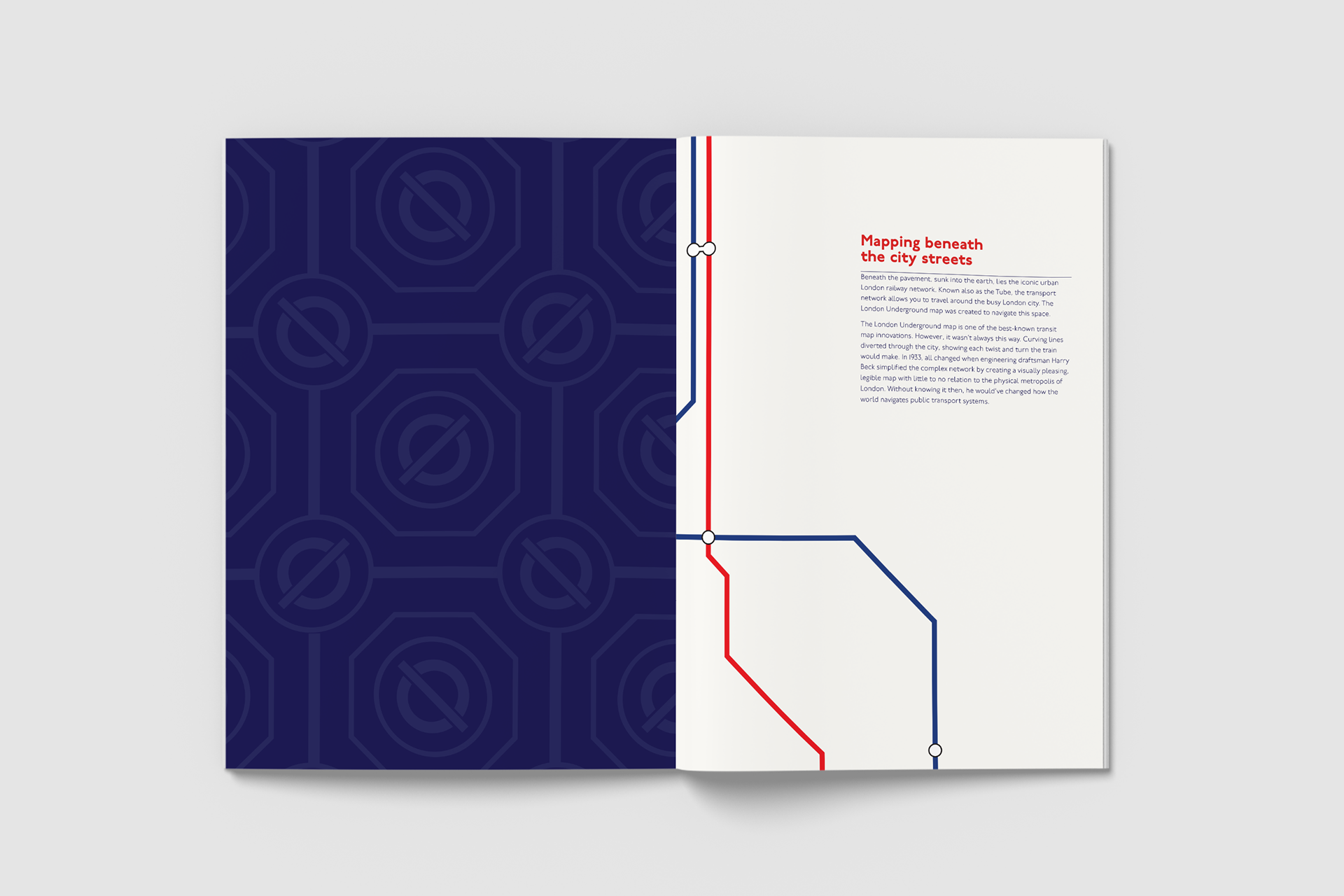
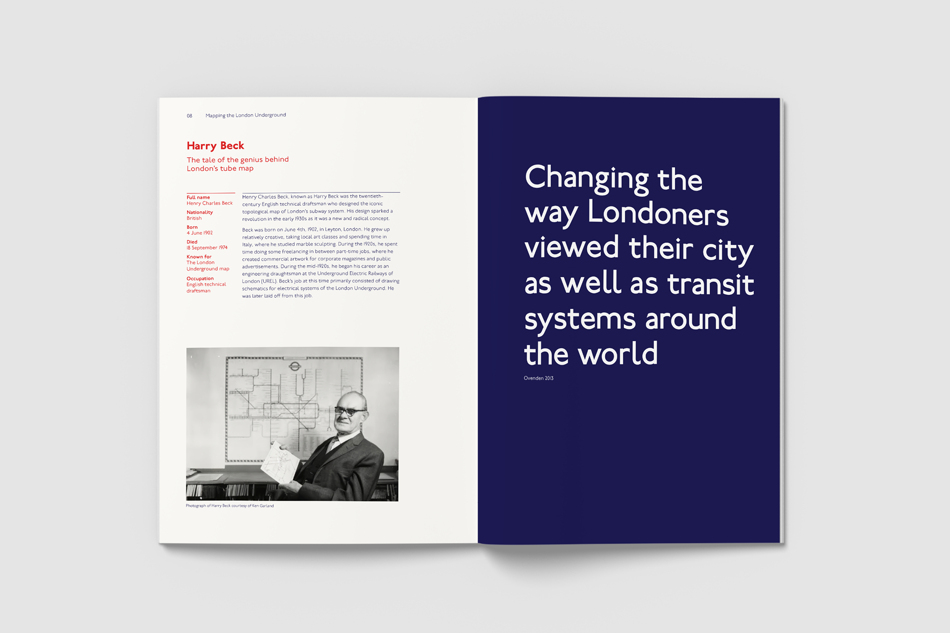
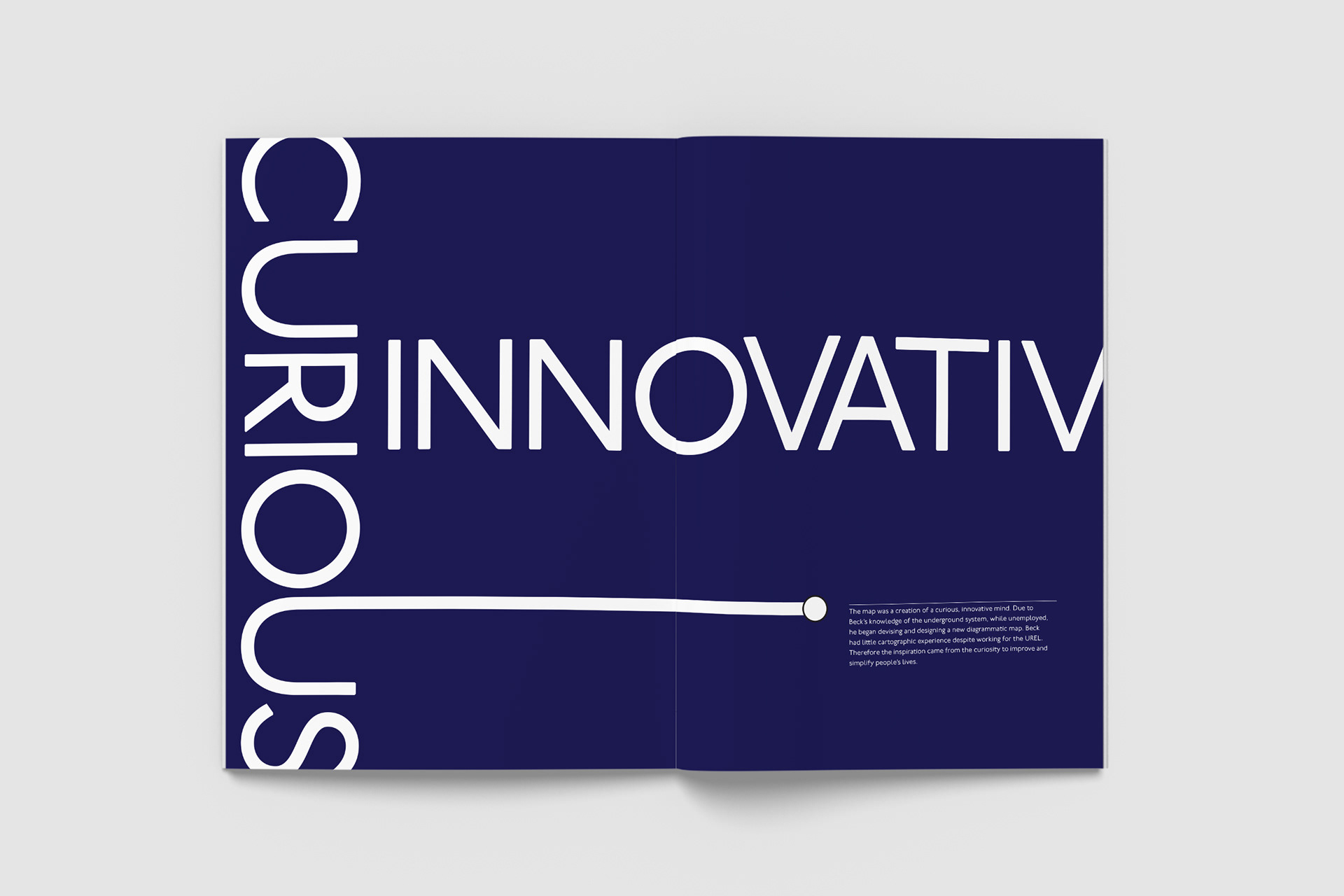
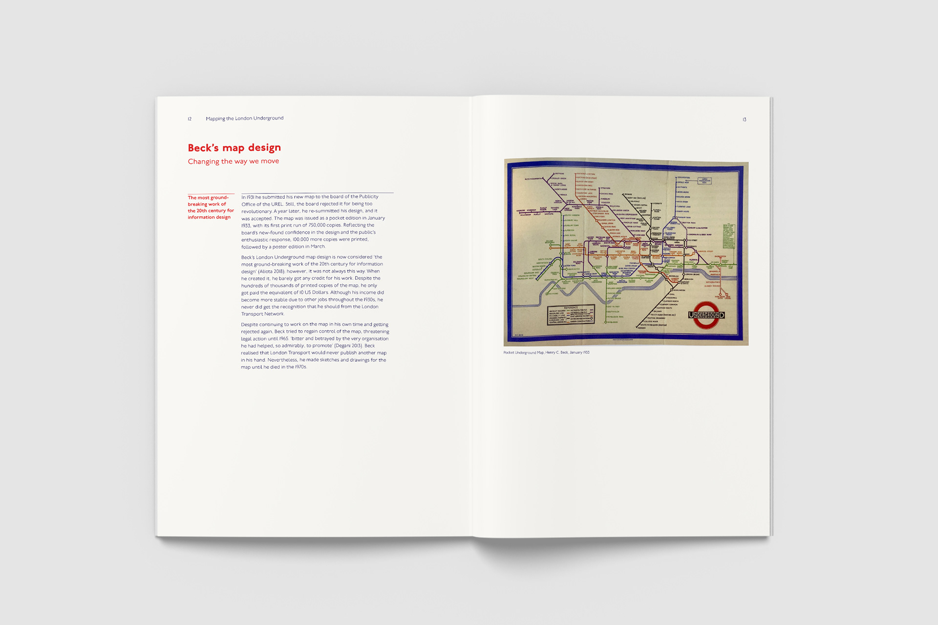
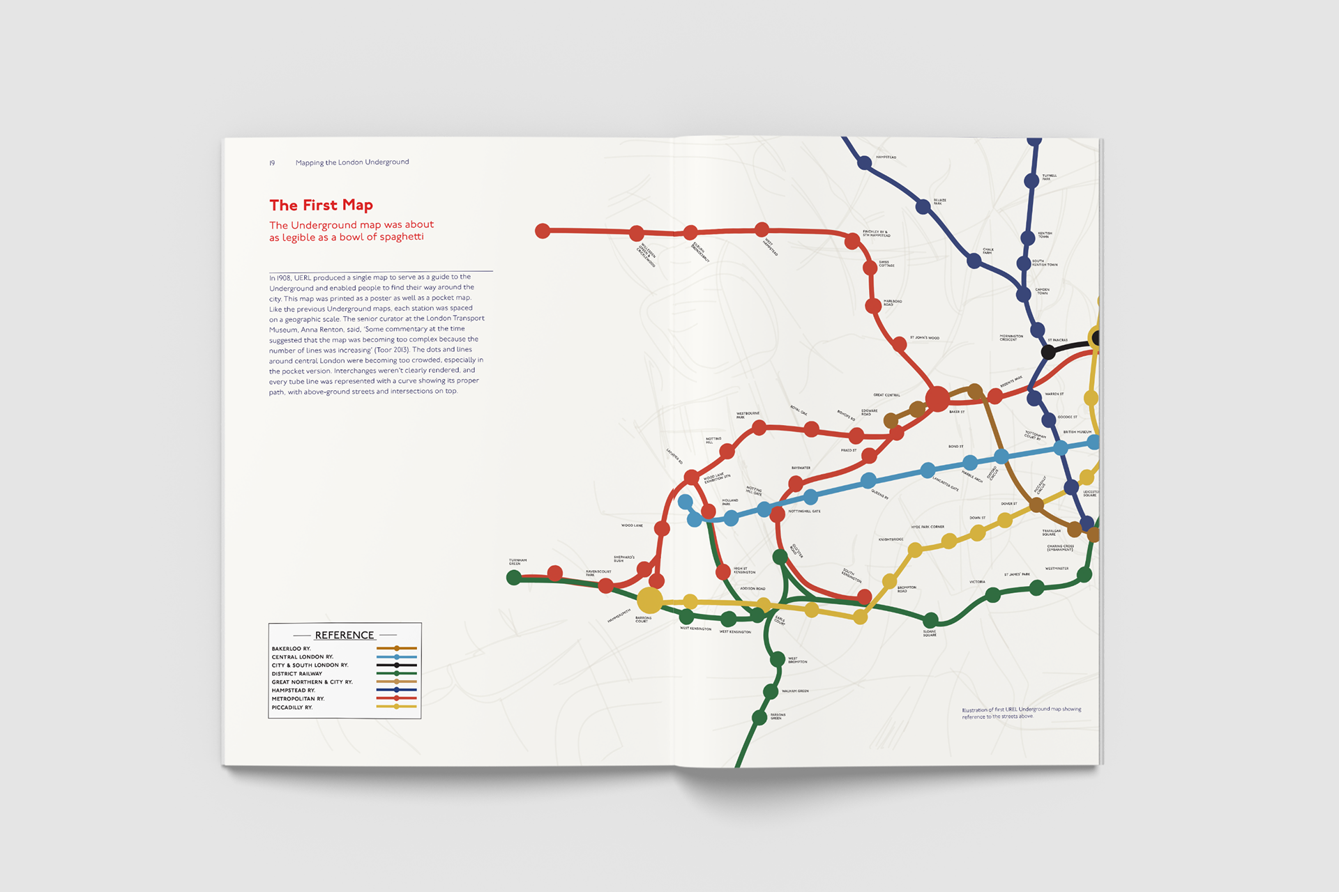
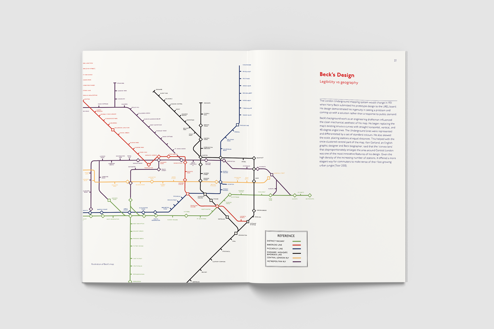
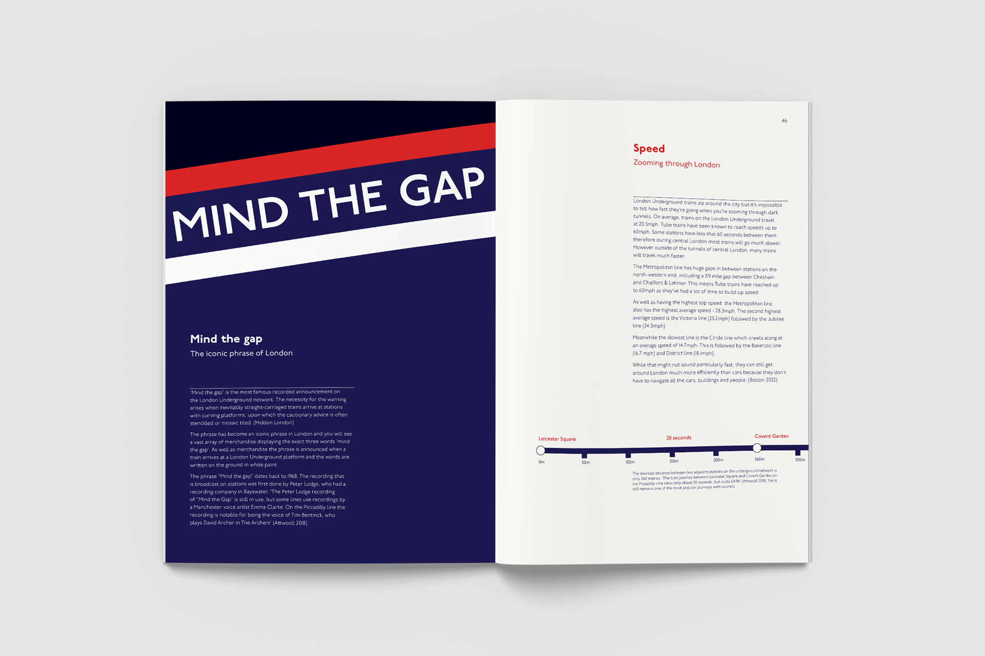
Below the pavement, sunk into the earth, lies the 160 year old London railway network. The London Underground map is one of the most well-known transit map innovations. However, it wasn’t always this way. Chaotic curving lines diverted through the city map showing each twist and turn. In 1933, engineering draftsman Harry Beck simplified the complex network by creating a visually pleasing, legible map with little to no relation to the physical metropolis of London. Using electrical circuiting as a reference, the map was stripped back and now has the stations located on vertical, horizontal and 45-degree diagonal lines. Beck’s conception of space has influenced global transit maps, which we use almost daily.
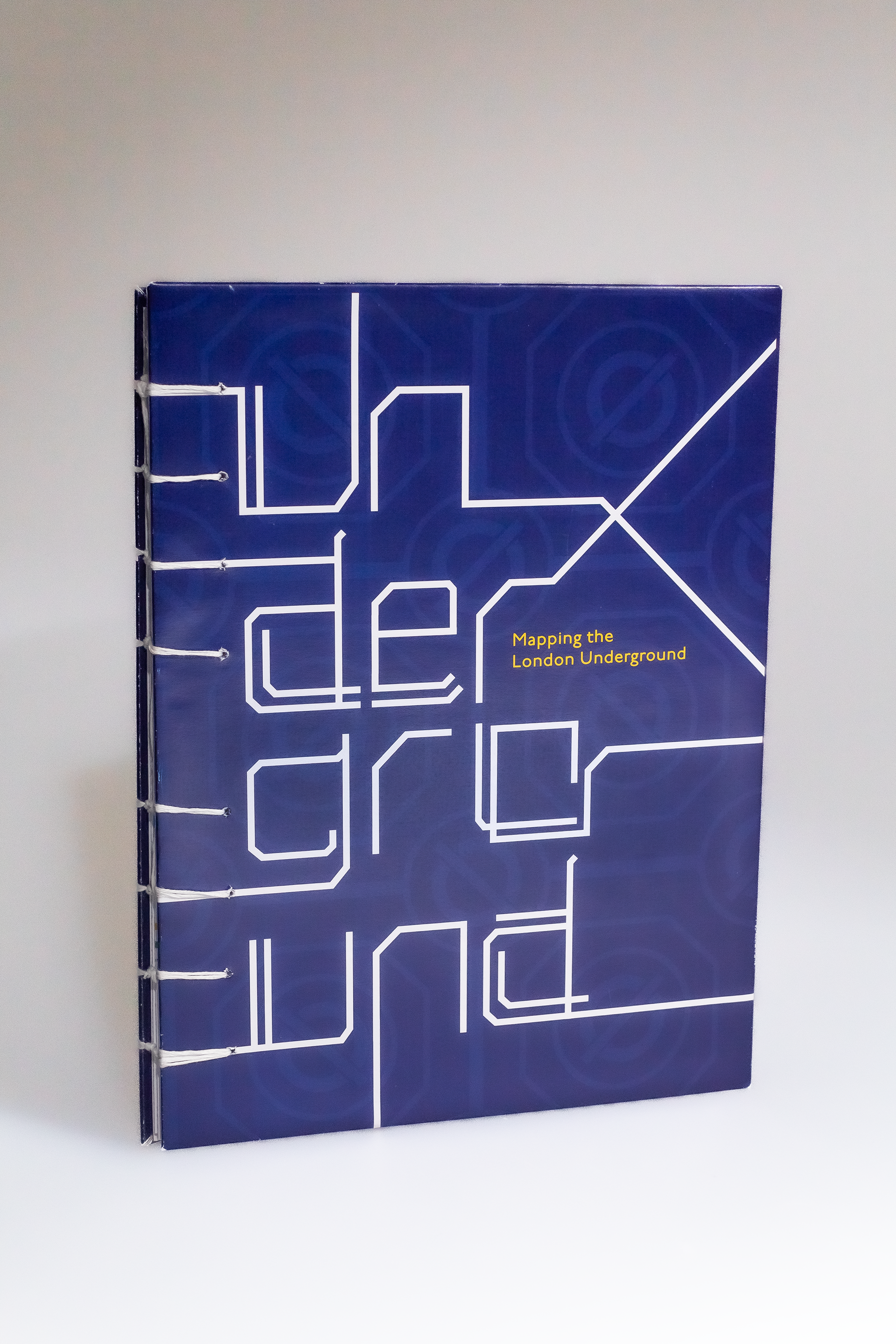
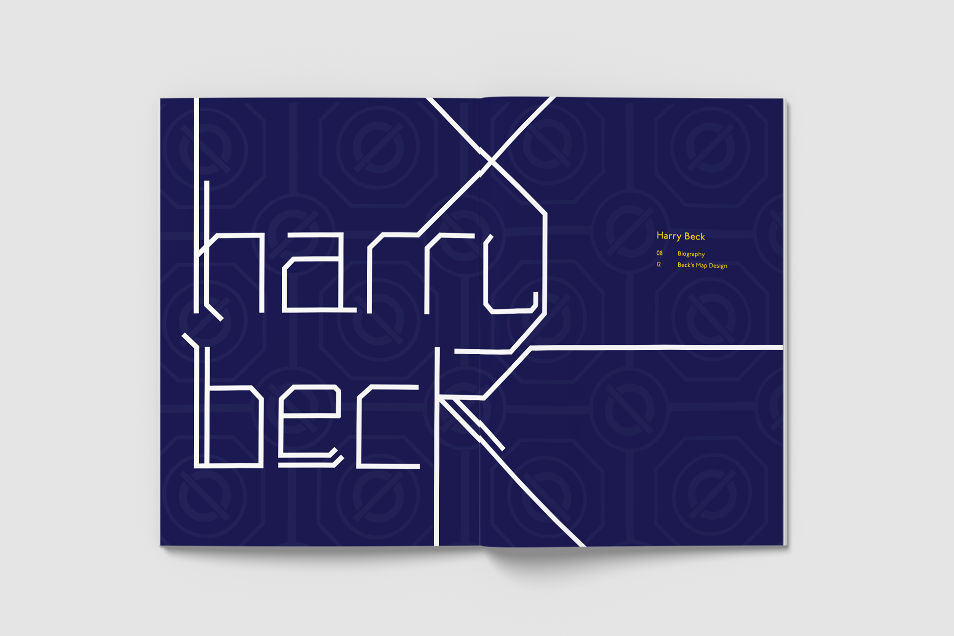
This book responds to the ISTD (International society of typographic designers) 2023 brief, 'Mapping the World'. It aims to showcase the map designer, Harry Beck, the history of the Underground maps from the beginning to the current day and the details around the Underground’s brand identity and experience.
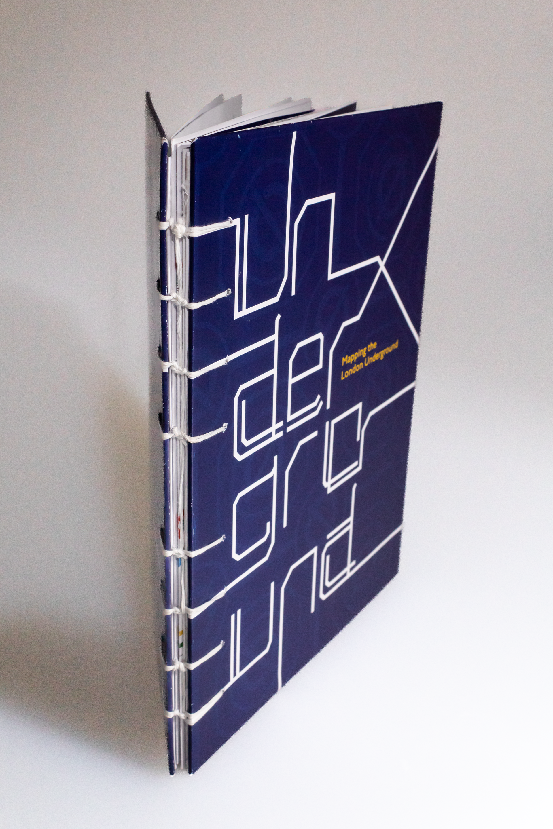
This book has been printed and handcrafted by myself. The binding method plays a key role in the look and feel of this book. The threads in the coptic stitching link the lines of the text resembling the lines on Harry Beck's iconic map design.
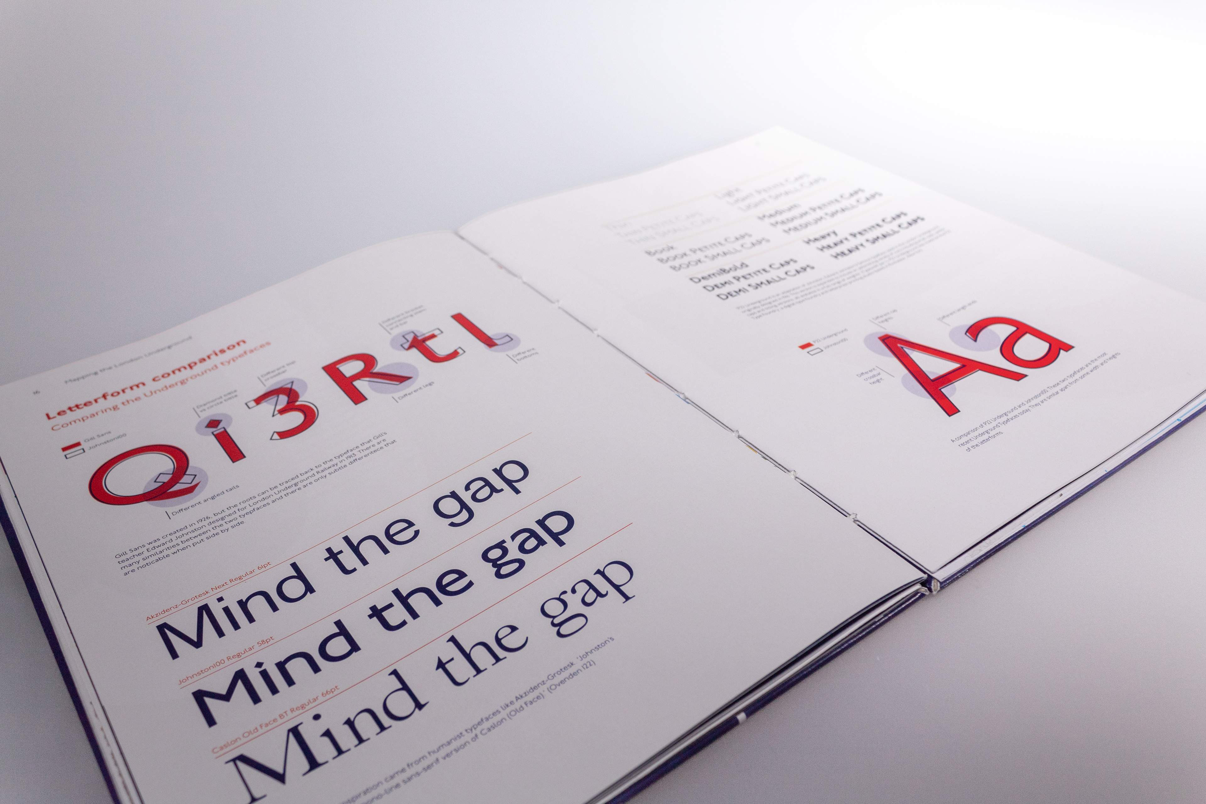
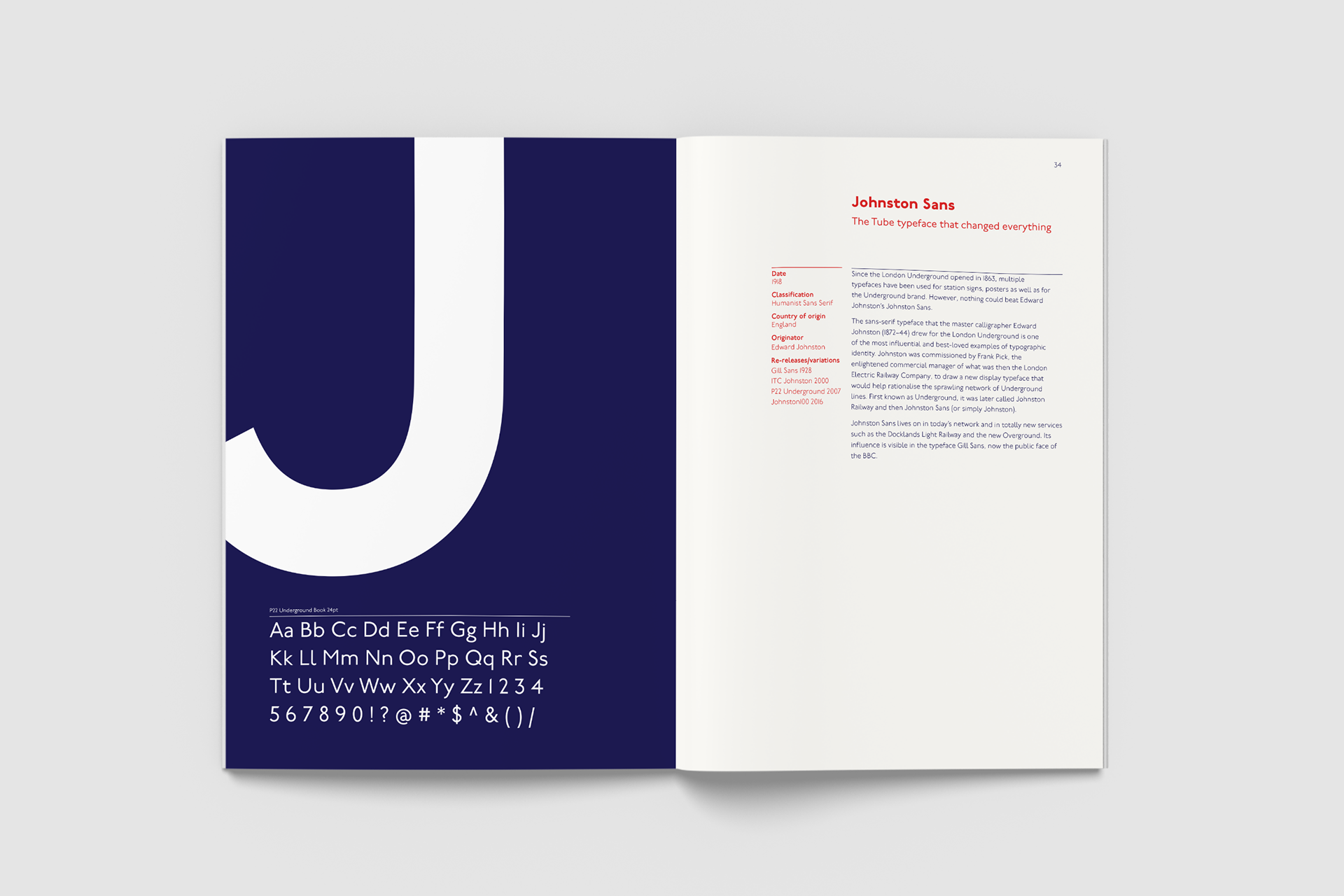
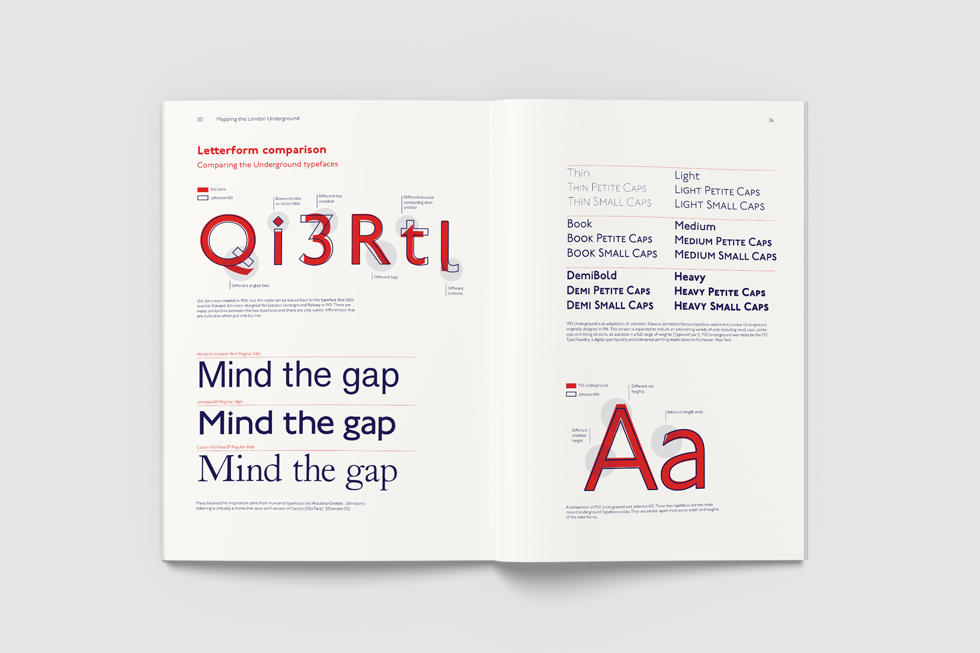
There is a consistent style and system throughout the book due to the colour and type choices. The London Underground brand colours of red, blue, and white have been used, as well as some accent colours for each station line. P22 Underground is the primary typeface as it is a variation of Johnston Sans, the typeface of the Underground, but also because it has various weights making it versatile
for headers, sub-headers, body copy and captions.
for headers, sub-headers, body copy and captions.
Fourth year Design Awards and Competitions University paper - 2023